Brand Identity
GUESS Rebrand
GUESS Rebrand
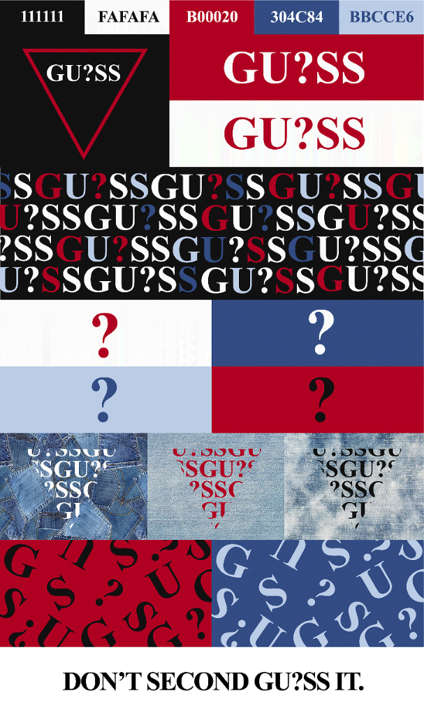
A bold reimagining embracing youthful rebellion and iconic American denim culture. The signature question mark becomes: "Don't Second GU?SS It."
Classic black and off-white meet vibrant red and navy blue accents. The inverted triangle logo anchors the identity while playful typography patterns create versatility across all touchpoints.
Visual Systems
Cohesive design languages that scale seamlessly across all platforms, from digital interfaces to physical brand materials. Every element works together to create memorable, consistent brand experiences that resonate with your audience.
Victoria's Secret Rebrand
Victoria's Secret Rebrand
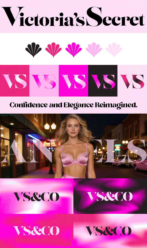
A transformative rebrand championing "Confidence and Elegance Reimagined."Celebrating diverse beauty, empowerment, and modern femininity.
From hot pink to soft blush with black sophistication. Custom Losta Masta typeface brings elegance to the wordmark, while shell motifs and VS&CO sub-brand extend into lifestyle and wellness.
Brand Guidelines
Comprehensive documentation that empowers teams to maintain brand integrity. Detailed specifications for logo usage, color systems, typography hierarchy, and visual applications ensure consistent, impactful brand presence across all touchpoints.
Fashion Friends Collective
Fashion Friends Collective
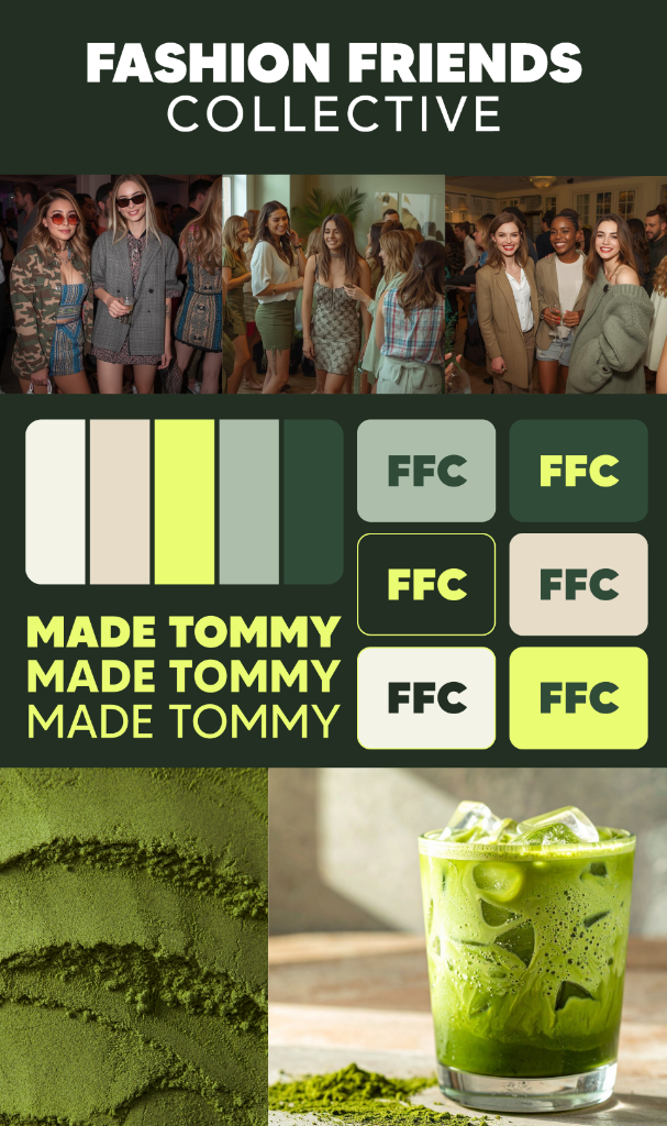
A visual branding system crafted for Fashion Friends Collective, a fashion mentorship company dedicated to empowering the next generation of industry professionals.
The identity draws from a rich earthy green palette—deep forest, sage, chartreuse, and warm cream—reflecting growth, community, and approachable sophistication. Bold typography anchors the wordmark while the FFC monogram adapts fluidly across color combinations, ensuring versatility from digital platforms to brand collaborations.
Through educational programming, curated resources, community-driven events, and thoughtful brand partnerships, FFC's visual language communicates both credibility and warmth—a brand that feels as welcoming as it is aspirational.
Community-Driven Identity
A versatile FFC monogram system adapts across six distinct color combinations—from deep forest green to bright chartreuse—ensuring the brand remains bold and recognizable across every touchpoint, from digital content to event collateral and brand collaborations.
NOETIC
NOETIC
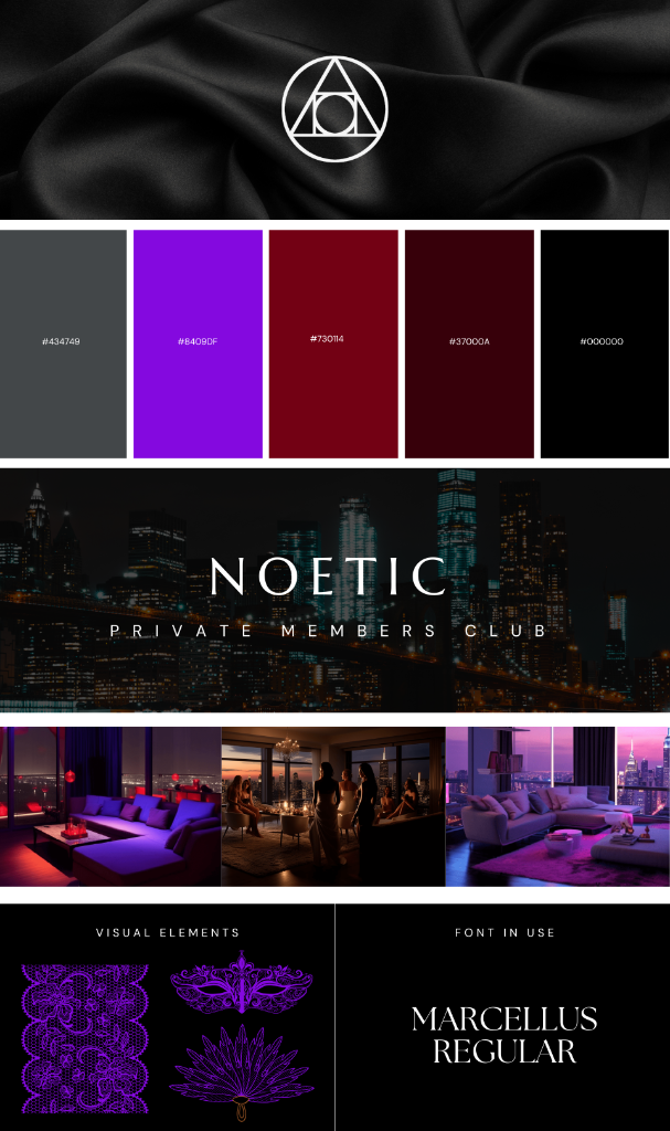
An exclusive private members club merging luxury with mystique. The geometric sacred symbol—circle, triangle, and sphere—represents unity, balance, and infinite possibility.
Deep grays meet electric purple and rich burgundy tones, creating an atmosphere of sophisticated nightlife. Marcellus Regular serif typeface adds timeless elegance, while ornate patterns evoke exclusivity and refined taste.
Color & Typography
Strategic selection of color palettes and typefaces that evoke specific emotions and create instant brand recognition. Every choice is intentional, supporting your brand narrative while ensuring accessibility and visual harmony across all applications.
Mood Board
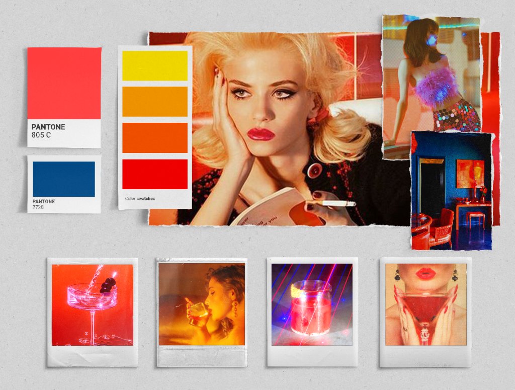
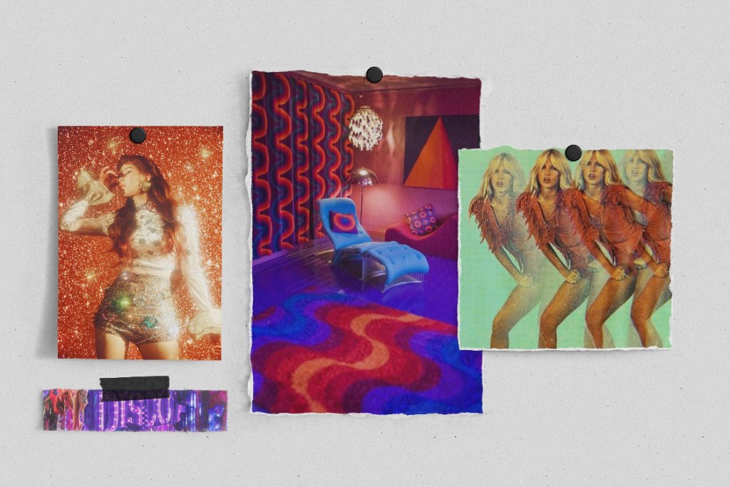
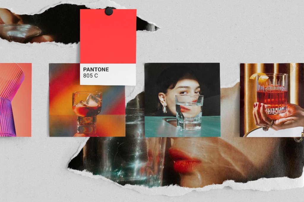
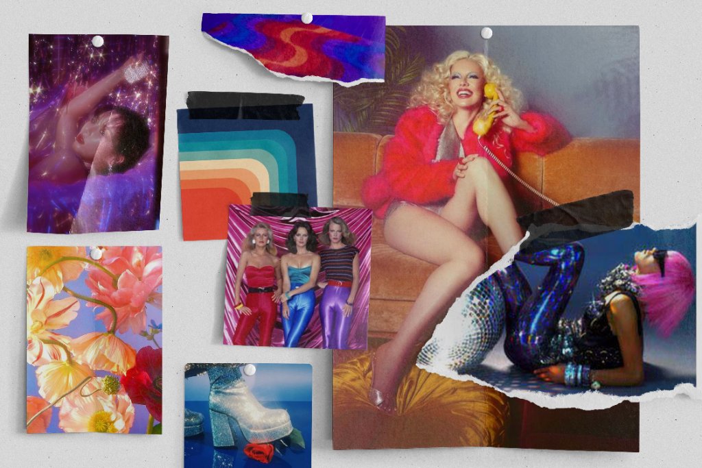
Mood boards inspired by the vibrant mix of late 1970s retro disco.